Think about your last experience in a retail store. Did you pause for a brief moment at the front of the store, and then turn right? You’re not the only one. Did certain fixtures or displays catch your eye as you made your way to the product you wanted? That’s not a coincidence. Was the most necessary item on your list located at the back of the store? Not an accident.
“Everything, everything in retail is done for a reason,” said Bob Mayslak, a retail design consultant with Gladson Design Group, a Syndigo company that helps retailers plan and execute in-store arrangements. “There’s quite a bit more science to it than you would think.”
The science of store layouts has been studied, tested, and honed by corporate retailers and big-box giants for decades. In the end, the science is about money. How do you arrange your store layout to move the most merchandise? And to enhance the customer experience so they keep coming back?
A layout primarily refers to the floor plan and the arrangement of fixtures in your front end, which reflects how you want to flow your space and present your merchandise. The best layouts increase sales at every stage of the shopper’s journey through the store.
“If you can create a predictable traffic flow pattern, that will essentially be your guide as to where you’re going to merchandise everything,” Mayslak said. “For example, if CBD has been a big boost to your sales in the past six months, we want to make sure that everybody gets to see them. If we know the traffic pattern then we know predictably where you’re going to go. We can have that be right in an area displayed to where you can’t help but stop and look at it.”
Your pharmacy layout influences your customer experience, for better or for worse. “Knowing how to best flow your customers through that space won’t only affect your bottom line, but it will impact how your customers perceive you,” said Jason Trail, a senior enterprise solutions architect and floor and space planning expert for Plantensive. “It will greatly impact the customer’s perception of how well-managed and well-run some locations are. So, unless you use your space appropriately, just putting out more merchandise isn’t necessarily going to help. It actually could hurt you in the long run.”
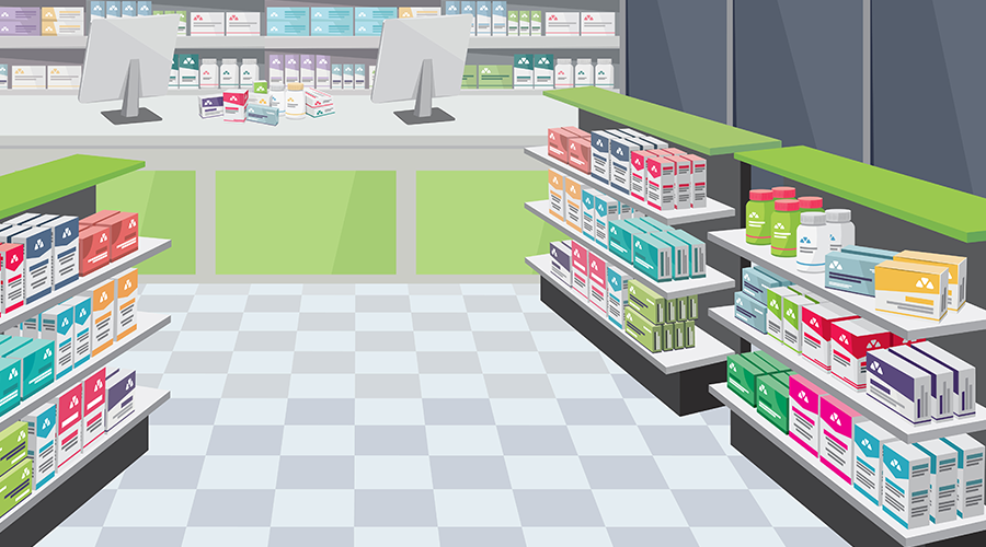
The basics of retail pharmacy layouts
There are certain universal truths about how shoppers move through, perceive, and experience a retail space. These tried-and-true concepts apply to every retail layout and should influence how you design your front end.
When people first walk in the store, they enter the decompression zone. This is the first 10 or so feet of space just after the entrance of your pharmacy. “It’s essentially like an invisible vestibule where you stop and gather yourself when you walk into a place,” Mayslak said. “It puts everyone into a calmer frame of mind. Everybody needs to decompress when they get into a new environment. So that’s a very important area.” It should always be clear of ads or merchandise so visitors can orient themselves in the new space.
After leaving the decompression zone, almost everyone will turn to the right and work through the store counter-clockwise, Trail said. Because of this, most stores place a display known as a power wall directly to the right of the front door. It contains their highest-margin products or premium products they’re interested in promoting. The tendency of people to move counter-clockwise is also why many pharmacies put the pharmacy counter in the back of the store, depending on the location of the entrance, so shoppers will make the whole loop around the front end.
As shoppers work their way through the store, they should experience speed bumps along the way. “The idea of speed bumps is to slow them down and actually make them stop and look at something that they may not have thought about before,” Trail said. “The big thing is to think about getting a display that will draw them in. The display can be interactive, it can be demonstrative, or it could even provide an overall solution.”
“Essentially,” Mayslak said, “it’s anything that will get you to stop your natural flow of walking through the store to engage in some of the things that you’re trying to sell additionally.”
With these core concepts in mind, you can begin to draw up your layout.
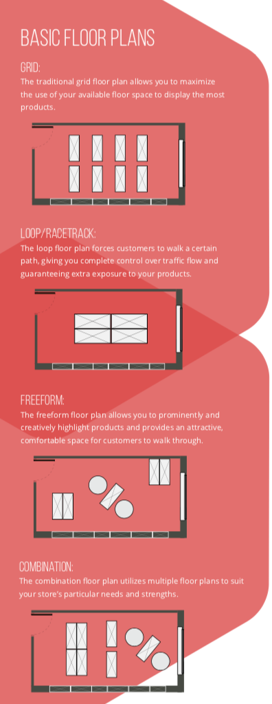
Choosing the pharmacy layout
Designing a layout is a little bit art and a little bit science. There’s no one-size-fits-all for community pharmacies. The only universal truth is the placement of the pharmacy counter. “Having the pharmacy at the back is the most ideal scenario for independent pharmacy,” Mayslak said. “Use the pharmacy as an anchor and have that be the guide through the store.”
Other than that, your layout will depend on several factors, starting with your goals. “It’s all going to be dictated upon what it is that you’re trying to accomplish,” Mayslak said. “You want to highlight whatever it is that you’re known for or want to be known for and expose everybody to as much of what you’re offering as possible. And keep the future in mind. Don’t design it for what you’re doing right now. Design it for what you’re doing five years from now, so you’re not doing this project every ten years.”
He gave the example of a pharmacy that specialized in compounding—that was the engine of the business, what drew patients through the pharmacy doors. Instead of designing the space around the compounding area—adding unique features like a window into the lab—they went with a traditional layout with lots of front-end space. That choice cost them. “They wanted to focus on something else rather than what we already knew was their bread and butter,” Mayslak said.
Two other factors that Trail said should shape your layout choices are your space and your customers, which vary from pharmacy to pharmacy. Don’t assume you can mimic any other store and plug in some standard pharmacy layout.
Mayslak echoed that sentiment. “Work with the space that’s there as opposed to trying to take what you know in a more traditional setting and make that work,” he said. “Make sure you allocate your bread and butter and then work around the stuff you want to add.”
“Everything, everything in retail is done for a reason.”
Carefully consider the overall square footage and the shape of your building. With that in mind, think broadly about where the different departments should live, where the pharmacy counter will be, where the checkouts should go. As you consider each of these factors, tailor your choices to what’s most important to your pharmacy, Trail said.
Then factor in elements that could pose a challenge: Do you have large columns or load-bearing walls that can’t be moved? Is your fire exit at risk of being blocked? Is the store’s shape highly irregular? Pharmacies can adapt their building to highlight the space’s strengths and minimize its challenges. “Look at the constraints of the building as an asset to differentiate yourself,” Trail said.
For example, Trail has seen businesses with extremely long, narrow properties utilize different floor tiles to help indicate a clearer path through the store. Other pharmacies may employ techniques like “waterfall” fixture heights to pull patients’ attention to the back of the store. For unusual or irregular shapes, it might make sense to combine multiple layout patterns, Trail said. For example, a store that’s narrow up front and wide in back could use a main aisle in the narrow space which opens up to a racetrack in the wide space.
Once you take your space, priorities, and restraints into account, consider who patronizes your pharmacy and who’s competing with you down the street. Are you in an area where your customers just want to get in and out quickly? Are you the go-to stop for retail products? Is your store the only place for local and boutique merchandise? What do you want to be known for?
“Start thinking about your customer base and how you want to flow them through the area,” Trail said. “That’s where you can decide how much space you’re going to give to the individual merchandise categories for your sales floor.”
After you’ve finished your layout and customers come streaming through your store, there’s still work to do. Mayslak said to keep close track of your sales data for every category and area of the store, which will allow you to adjust your fixtures and merchandising decisions to find an optimal arrangement that maximizes your sales.
“I know you’re never, as an independent pharmacy, you’re never going to do 40 or 50 percent out front,” Mayslak said. “But if you can raise that revenue number 10, 15 percent, that’s a significant amount of additional revenue that would be very helpful to every small business owner.”
Quick Tips From the Experts
A retail layout is only as good as the merchandising it’s paired with. Retail design experts Bob Mayslak and Jason Trail give some layout and merchandising recommendations for strategic and commonly neglected areas of your store.
Pharmacy counter
Use the area near the pharmacy counter for items that can benefit from a pharmacist’s expertise, like vitamins and supplements or CBD products. Keeping them close to the pharmacy counter makes it easier for curious shoppers to ask questions about unfamiliar products and helps pharmacists more easily recommend items to patients. “About 98 percent of the time when a pharmacist hands you a product, you’re going to buy it,” Mayslak said.
Checkout
A common pitfall in checkouts is an inefficient or confusing setup. Mayslak and Trail both stressed the value of clear paths and signage that guide customers to the right checkout lines. The checkout should also be arranged to minimize cluttered space and long lines. “If it gets frustrating enough, somebody’s going to set their product down and walk out the door,” Trail said.
Product placement
Put items that shoppers aren’t typically coming into the store to buy, such as impulse items and promotional products, in outside aisles where there’s high visibility and traffic. Put your “seek-and-destroy” products, like cough and cold, in your inner aisles. As shoppers search for their intended products on the inner aisles, they’ll have to pass the outer aisles to get there. “Having a reminder that it’s there might get me to stop and buy something that I didn’t necessarily intend to buy,” Mayslak said.
End caps
End caps can bring people’s attention to an item they wouldn’t have seen in the aisle and lead to more sales. Switch up your end caps at least once a month, but ideally twice a month. “If you have the same item in an aisle versus on the end cap, you’re going to sell roughly 25 to 30 percent more, so changing those things out is going to get them to buy a little bit more,” Mayslak said.
Breaks
Every layout should include strategically placed areas for people to slow down. “You want to give them areas to naturally stop and survey the products that are out there,” Mayslak said. “And that’s why the end caps or promo aisle or anything that kind of draws your eye to it is rather important as far as retailing and merchandising.”
Aesthetics
As you’re drawing up your layout plans, don’t neglect any details of your store design. “Make sure that you look at every little thing, as it affects something else. How you want that place to be perceived is going to be affected by all the decisions you make from the ceiling tiles down to the flooring, down to where the shelving is and how the pharmacy is set up,” Mayslak said. “So take everything into consideration when you’re doing it.”
The Language of Layouts
Are you fluent in the vocabulary of retail layouts? Here are some key terms to know.
Decompression zone: The area around a store entrance where the customers will get their bearings before proceeding through your space.
Power wall: A large, visually appealing display in the area to the right of the decompression zone. This is typically a customer’s first interaction with your merchandise after entering the store.
Speed bump: Strategically placed displays in the store that attempt to grab the attention of the customer and get them to slow down and browse.
Planogram: A diagram for arranging products in categories on retail shelves to maximize front-end sales.
Gondola: A freestanding, shelved fixture used to display merchandise.
From the Magazine
This article was published in our quarterly print magazine, which covers relevant topics in greater depth featuring leading experts in the industry. Subscribe to receive the quarterly print issue in your mailbox. All registered independent pharmacies in the U.S. are eligible to receive a free subscription.
Read more articles from the March issue:
- How to maximize rebates and profitability on pharmacy inventory
- These are the top front-end items to get on your pharmacy selves
- How to get five-star reviews online and why you can’t afford anything less
- This independent pharmacy owner is standing up to PBMs
- How to reap more revenue with your point-of-sale system
- How safe is your pharmacy from a robbery?
- Is technology the solution to non-adherence?
A Member-Owned Company Serving Independent Pharmacies
PBA Health is dedicated to helping independent pharmacies reach their full potential on the buy-side of their business. Founded and run by pharmacists, PBA Health serves independent pharmacies with group purchasing services, wholesaler contract negotiations, proprietary purchasing tools, and more.
An HDA member, PBA Health operates its own NABP-accredited warehouse with more than 6,000 SKUs, including brands, generics, narcotics CII-CV, cold-storage products, and over-the-counter (OTC) products — offering the lowest prices in the secondary market.